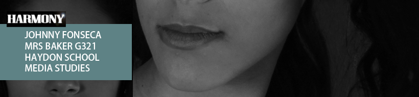
Front Cover Sketch

This is my first plan of my magazine, as I am going to for classic R&B magazine I wanted the front cover to be very simple but grab the readers attention and to do this I thought a competition would lead people into the magazine. I also wanted to have a name which will focus on the R&B genre so I felt "Harmony" was best suited. Also moving on I want to use a nice clean portrait shot of my model in black and white on the front cover. I also felt that by adding artists names, this would then attract readers who are fans of the following artists "Ne-Yo, Trey Songz, Rihanna, Beyonce or of course the main artist for this issue, the new upcoming "Antonia".
Contents Page Sketch

Moving on I wanted my contents page to be clean and simple, I didn't want too many pictures maximum two I did this as the main objective for the contents page is to inform and by having so many pictures and colours on the page the reader will get confused and instantly get distracted by all the colours and not the information itself.
1st Double Page Spread

On the first double page I wanted this page to be an introduction page to the whole interview, saying this meant that there was only going to be a little part of the article to introduce the article and set the interview and then to engage the audience I would use an interesting pull quote to grab them into the article and make them read it! Also I felt a large photo of Antonia should be displayed on the double page to illustrate who the article is on. Of course I added the page number and website to each page in the magazine, as this is a convention of a music magazine.
2nd Double Page Spread

This double page spread is the where the main chunk of the interview/article will be at, this means that I have to have some sort of thing to grab the audiences attention while there reading the article to keep them interested. For example after a column of article I have included a column of photos which will be all studio shots of the artists, this is so that the readers are kept entertained whilst reading the article. I then add the rest of the article column which will then finish on the next double page spread. Then to finish off the double page spread I will present a photo of the artist on a whole page. Not forgetting the convention of the page number and website on each page.
3rd Double Page Spread

Lastly This page was simple, it was the last page of the article so I instantly knew I wanted the main photo to be a performance shot which will be placed in the background and on top I would have a quote displayed to keep the readers going and for them to finish the article. Then I would finish the article. Lastly I also added an image of a behind the scenes shot and will be adding a description or the readers to visit the website to view the behind the scene, this will then create more traffic for the magazines website.
No comments:
Post a Comment