Friday 28 December 2012

Sell Lines

What is a sell line?

A sell line is basically a collection of specific words which translate into a strategic intent into an executioner promise of benefit to the consumer and makes this benefit belong to you. A sell line is a means to an end. The main purpose of a sell line it to help you/your brand by creating a meaningful sum of words to describe your product, business or idea in a simple way, often quirky or playing on words.

Summary
In basic term it is a sum of words which summaries or describe your product  business or idea, usually fun and creative.

What I wanted to do...
I want my sell lines to link with my magazine, the genre and the content but in a way which can bring in and sell the audience. I want them to make people talk and wonder about it. Something which will be stuck with them for a while.

Here is a couple of ideas I had in mind...
-Ne-Yo, Rihanna, Beyonce, Trey Songz, Usher, Justin Bieber, Kelly Rowland
-Best Magazine of the year
-Your missing out...
-Free Music
-Signed CD Competition
-Posters
-Top 50 Albums of the year
-The upcoming artist Antonia

Wednesday 26 December 2012

Production Log #23


I have now just chosen my colour scheme and with the help from some friends we came to the conclusion that a black, white, grey and then a nice gold would be perfect for my classic look which I am trying to create. I began looking for tutorials on how to create a gold look on my text and found a perfect video on Google: http://psd.tutsplus.com/tutorials/text-effects-tutorials/gold-text-effect-photoshop/

Sunday 23 December 2012

Production Log #22

I have just completed my colour connotations and I feel that its also the right move to do my colour scheme next. The colour connotations is a simple task yet again I seemed like I over thinked it as usual. By this time I really just want to get to start my magazine but I still haven't done the right amount of research so I took some extra time to do some research and post it here:

I did some extra research into the list of artists who are known as classic R&B which I could use in my magazine for example:
Here is a picture with Beyonce

-Jessie J
-Ne-Yo
-Trey Songz
-Rihanna
-Chris Brown
-Beyonce
-Conor Maynard
-Mario
-Omarion

These are just a quick list I created about the artists who fit the R&B genre categories  I feel that my main article the upcoming artist links with the Beyonce as they are both diva like characters who love to do what they do. 

Thursday 20 December 2012

Production Log #21


After completing that I felt a bit of research was needed to be done so I could keep refreshing my mind about the content which my magazine could have, I looked at magazines such as VIBE and Q to gain my ideas for my magazine. The one thing I began to notice through the research is that the photos are on point! There so sharp and clear and then they also look fantastic and interesting, for example this black and white VIBE front cover I became instantly engaged when I noticed his expressions, I didn't know if he was happy or sad and I wanted to find out! I need to take note of that idea and do a similar front cover image for my magazine

Wednesday 19 December 2012

Contents & Double Page Spread Image Ideas

As there is smaller images, I uploaded the work onto prezi so you can zoom into the shot as much as you want.

Monday 17 December 2012

Production Log #20

Straight away you can tell I uploaded my work to prezi, but I didn't actually design it in prezi, however prezi allows my blog readers to zoom in to images and zoom out when they please. I couldn't upload the film to scribd as its a JPEG which I created on Photoshop but thinking of it now I could of put the image on a word document and saved it, however saying that I do really like the freedom of prezi and how the reader can zoom in as close as they like. I think I will keep using this method as I think it illustrate a creative side to my work and is in the blogs favor as they can zoom closer. My next task is to get yet another page of image ideas for my other pages which will be interesting, I basically get images/poses I like of the current celebrities/models and hopefully try recreate them in my photo shoot. 

Thursday 13 December 2012

Production Log #19

Today's was the day where I look back at my work and see everything that I have done on my blog. I also left some tasks uncompleted and so I took the time out of my schedule and worked on them. I also began to realize I do a production log after every task, my aim is too keep doing this till I finish this blog. Going back to what I have been doing, I created a video of a focus group in class with a group of friends, This actually really helped as I began to find out what people liked about my ideas and mastheads and if they didn't we did discus why?

Monday 10 December 2012

Production Log #18

My next post should be interesting, fresh and new! Me and some friends are going to record our focus groups. Also I am really please with how my name designs actually went and I am proud to say that the mast head that I finally chose was my ideal font and that I wouldnt change it for anything. It fits R&B perfectly specially with the light white glow is has to it.

Thursday 6 December 2012

Production Log #17

On my last post I am use prezi to creak the slick cool Name Ideas powerpoint. I felt that this task was relatively easy as I already knew that I wanted the title to be a 1 worder. I created a simple list of names and chose a few I liked and spoke about them. The next task I will be starting is Name Designs which closely links to Name Ideas! I am not really worried or confused about this task as we have already researched many magazine which has made my selection of mastheads more open.

Monday 3 December 2012

Production Log #16


I have just completed my mood board which I personally feel that the board look interesting specially with all the photos I used and the variation of poses, body expressions colour and people itself. My next task is all about Name Ideas and I have began to look on the web for some ideas, of course Wikipedia came up and I found a whole page full of existing ones, what this meant is that I could read all of them and get an idea of how catchy the name is. 

Friday 30 November 2012

R&B Mood Board


Here are some of my ideas for my R&B magazine. I have already found my model, Antonia, she has afro like hair which can open many possibilities to different hairstyles. I really like the different styles of photos on my mood board, some of them are of different live performance photos which i'm basically thinking about having the same sort of photo for my cover photo. Some photos are also of equipment props i'm thinking of using for example jewelry and microphones.

I am going to continue to look at magazine images to gain ideas and find more styles to add to my mood board. Even thought I already have an idea of the sort of photography i'm looking for I still want to keep my mind open.

Thursday 29 November 2012

Production Log #15

Yet again I used scribd to upload my R&B profile and if your wondering why I didn't just create it on the blog platform as it's just writing, its because sometimes blogger like to play up on me and when I finsih creating a post and when I look at the finished product it looks completely different. 

Sunday 25 November 2012

Production Log #14

Like I mentioned before about scribd being a website where I could upload and embed the documents in my folder, it is actually very useful and easy and I can see that I will be using it in my future posts. I created my Target Audience on word and simply uploaded it to scibd. I have finally come to conclusion the target audience I will be targeting and now I can begin doing research on what they like.

Wednesday 21 November 2012

Production Log #13

After obtaining the results from the survey I now have a clearer understand about my pricing and content which R&B fans want to actually see, also the survey monkey website has proven to be actually quite easy and I would reccomend it to anyone in need of creating a survey. Also I did extra research into the types of music R&B fans listen to:

Sunday 18 November 2012

Questionnaire Results

 I created a survery with many questions which I created. To create the surverymonkey.com, I inquired information that will be helpful for when I make my own music magazine, as it gives an outline on who my audience will be. I then went onto the results part of my survey and made created graphs with the outcomes I collected, in order to get effective feedback.

I gave my survey out to 20 people (10 male and 10 female) to complete. The age had a variation from 15-26+. I wanted to get a variation of ages, so I gave my survey out to people who I knew were at all different ages, this was so I could determent what the age group would like in/about the magazine. Before the questionnaire I already knew what genre I am going to do so I chose specific people who enjoy R&B music.


One of my first questions were straight forward, the age of the person doing the survey. I wanted to see how old the people who were doing the survey were so I knew what sort of age genre was giving me my results. I found out that most of the people who did my magazine were people ages 22-25, meaning most of my results are from an older age and as I am trying to aim both young adults and old teenager there results would be perfect for helping me achieve that magazine quality i'm looking for which will engage that age group.


The nest question I asked on the questionnaire was the type of social networking sites people used. I already had a feel that Facebook and Twitter would be used by many people as they are very well known and used my many, however I also included three other options which were Tumblr, Instagram and Sound Cloud. Also This question was a multiple choice so they could answer more then one as they might have more then one social network. I was very surprised that Soundcloud had 11/20 people who actually use it as its not very known and only hardcore music lovers use it to find out about new and upcoming artists. This could be a way which I will promote my magazine with single previews of my upcoming artists. Also I was thinking about using a feed on my magazine for Instagram and Twitter and now that I know how many people actually use those social networking site I know people would be interested in seeing the feed.

One of my main questions which is always in any questionnaire  the gender! But as I explained before I wanted both 50/50 with the survey so I could have both answers from males and females and it will be equal  I also am trying to aim to both males and females and not just one specifically meaning I need to know what both genres read my magazine.


 I also wanted to know what people thought about my name ideas which I had, I was very pleased that 11 people out of 20 liked the name "Harmony" as that was my ideal name, however it doesn't really matter about what I like, it mostly matters about what the target audience like. As the questionnaire illustrates that people prefer Harmony as a name I will be used this name for my magazine as there the type of audience for my magazine, my main objective of my magazine is for my target audience to like the magazine as a whole.
 I felt the need to add a question about the type of content people buy a magazine for. The most chosen choice was Interviews and close second was about New artists/bands with 4/20. This really illustrates to me what people want to actually see in a magazine so I should focus on adding them in my magazine. However saying this doesn't mean I am not going to add anything else, I still think that adding competitions, gossip, etc is a good idea to add to a magazine as I will be for filling what people like, instead of choosing one factor which only 6 people out of 20 like. I want to try an engage as many people.
 Also for the front cover I wanted to add artists name as a way of engaging the readers and grab peoples attention, If I added well known names on the front people will be interested to see what its about and read about it. This will then make them buy the magazine as they want to read about their favorite artists, by putting there name on the front cover illustrates to the readers that in somewhat way they are included in the magazine. I found out from the questionnaire that out of the list I created Ne-Yo was one of the most known in the R&B industry following Beyonce, Trey Songz and Rihanna. As they are liked in the industry there will be a higher chance people will want to read anything to do with them.
Also one of my main questions which I felt was very important was the price, I wanted to know how much people are willing to spend on the magazine, however as I am going for a high class R&B magazine I am expecting people are willing to pay more, are my expectations was met! 11 people out of 20 are willing to pay £5.00+ for a classic R&B magazine. However 3 people were still willing to pay £4.00-£4.50, this illustrates to me that people are up for paying a very professional magazine if it included content them want. 


Lastly I included a question about there employment status, this question was multiple choice as some people could be student who work part time, etc. I found out that most of the people who did the questionnaire were students which illustrates that the information which I gained from this questionnaire was actually useful as the age range was actually around about what I was thinking of targeting. 

Overall I feel that by doing a questionnaire I have gained valuable information which will guide me to creating a high profitable and highly professional magazine which will be enjoyed by R&B fans. I will take each question and there answers in to consideration when creating my magazine and I will do this to make sure I interest and engage all of my target audience.

Saturday 17 November 2012

Production Log #12


SurveyMonkey LogoI have now begun to think about my questionnaire and the sort of questions which will actually benefit me and my magazine, however this is harder then I thought as you really have to consider what is useful or not. I am also getting ideas of doing an only survey instead of a physical one which I have to print out, so I found a website where I can create my survey and give it to people online e.g. my friends on facebook or twitter. The website is called Survey Monkey and on this site I am able to create a questionnaire for free and I am given an address which I can link/send to people to fill out for me. 

Thursday 15 November 2012

Production Log #11

I just completely finished my Proposal, I felt that yet again I should post it on the blogger platform as it gave the proposal a more meaningful post, it stands out compared to the rest which consists of images and text. It's different from the rest of my posts, it has a serious feel to it and that is what I was trying to create, Moving on I will now be starting my next task of "Target Audience" which I feel is the hardest of them all. But before I begin doing this task I got sheets to help me such as "Uses and Gratification, Pyscographics, Demographics, etc" and also got help from my teacher.

Monday 12 November 2012

Proposal

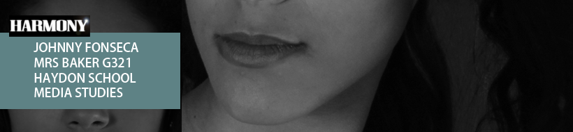
The genre of my magazine is old school R&B, which would include the main codes and conventions that are mostly of R&B tradition and style, it will follow sparkles and glamour at its finest to purely represent the R&B/Soul genre. The ideal front cover image would normally be a close up of an artist who is featured in the magazine and usually have the colour scheme of black and white involved in the front cover. If the artist was a male he would look very masculine and also very fearse but at the same time look like a gentlemen  The women on the other hand are all about class and sparkles. Sometimes they will be wearing very seductive clothing with expensive jewelry. The colour scheme will represent the genre so I thought I would go with colours such as black,white and yellowish colours. The mast head should basically represent the genre in a nutshell so my title has to very high standard and include something to represent R&B. Basically the title should consist of a glow/sparkle of some sort and I feel that lens flares fit perfectly with the theme but sometimes could make the magazine look tacky and unprofessional. The tag lines will have to be simple but still fit with the colour scheme, you don't want the tag line to be very bold as this will grab the readers attention to just the tag line and not the front cover as a whole. The genre which I am creating a magazine for will be following stereotypical costumes and colours which readers will understand and acknowledge immediately. I propose to follow these through the creation of my magazine and stick to the guidelines, however saying this, I must not forget to put my own twist into the magazine to make it feel original.

The target audience I am aiming for are teenagers and young adults which will mostly be between the age of 16-30, this is the sort of age range which will still be interested in reading music magazine due to there wide interest into the music world. However saying this they will defiantly go for a more professional and formal magazine instead of a magazine such as "Top of the Pops" which aims at children and we can tell this due to the content, layout and colours used to create it. The younger audience will also have more time to read magazine as they will not be as busy as others people with jobs and they will only be perusing a part time job at that time, thus giving them enough time to ready a magazine about there favorite genre. The older section of my target audience will be able to take some time out of their scheduled to read the magazine as they are less likely to be busy with looking after children due to the young age. The magazine will be both aimed at males and females. 

The specific psychographics of my target audience are people likely to have a passion for vintage music but still accept the evolution of R&B and where it's leading too in today's day. They would be have a wide range of knowledge on vintage artists, artists which are still in the career and also have an interest in the new comers. My targets demographics are defiantly spending time listening to music, but not listening it whilst doing there homework, they will deeply listen to the music by lying on the sofa and closing there eyes and just listening to the lyrics which the artists sings, each song has a story. They will also be very into glamour and class. R&B fans are usually into clothing and looking there best, there image is important to them and they don't want to give people a bad impression. They enjoy going to concerts of there favorite artists but compared to the loud screams and roars that rock fans do my target audience are most likely probably going to sing with the artist and have a more calm feel to it, but still including the screams as people can't stop themselves due to having so much respect for that artist and his music. R&B fans spend lots of time with family and friends and respect the stuff they have, they will also hold hobbies and passions such as singing, dressing up, going up, dancing. This information was all acquired from my mood board, these are the kind of things that my readers will be interested in. The social grade of my audience are mainly A,B,C1 as they are the classes which are most likely have the money to save/spend on an expensive magazine and are the class which are probably interesting in readying a music magazine which is about R&B which holds elements of glamour and class.

The uses and gratification theory are a main focus point in my magazine as all the elements would be placed for a reason in which my audience would recognize and react too. O fcourse the main purpose of people buying my magazine is because of entertainment, they enjoy reading about there favorite artist and his story of getting to his position he/she is at now. Also they enjoy hearing about new albums and concerts in the magazine. They might also buy the magazine as they desire to be a singer or meet the singer and know them better and by reading articles and Q & A's about them will make them that one step closer then other people. Maslows hierarchy of needs also plays a role in this part, as you will see how close my audience can relate to each stage of the pyramid, there will also be elements in which the audience will feel like they can connect with.

The main focuses of making a good, successful magazine is that the readers need to enjoy reading and feel as if they have a close relationship with the magazine and by subscribing to the magazine feel that extra closer and they will feel the need to read it. The publishing company which I felt would work best with my R&B music magazine is a company called IPC Media, they are very successful and publish for magazine such as NME, they are also a British company which sell over 30 million copies every year which is a large number for a publishing house.

Lastly I will represent the genre of R&B in a very stereotypical way, however I will take aspects from modern day and recreate the look for a R&B magazine. To illustrate this I am creating a new upcoming artist who holds elements from both the new R&B and old school R&B. This will both appeal to the old and new fans of R&B. I am attempting to create a diva like artist who has exploded her fame from YouTube. She will dress very classic and glamorous with a sparkly dress and in some occasions wear lots of jewelry  and very eye popping make-up, in some she will look more classic with a simple eye shadow and bracelet. She will be singing on stage and have live photos taken whilst she is performing, her performance will be very meaningful and relaxing. Some photos will include natural poses but some on the other hand will be more diva like and meaner attitude to the photos, on the other hand she will have serious poses to represent her strength and power as a women and singer of R&B, the casual smile will be also used to illustrate her natural environment. I have planned two completely different studio photo shoots which will go along the lines of this, one of her with props such as chairs, furniture with a her glamorous costume and a serious look, this will illustrate her diva like personality which she has gained from singing and becoming a performer in the R&B side. The last photo shoot will be her in a normal environment, her smiling and being happy, maybe with some family and friends. This will reinforce her personality and her style the article of R&B artists. I have looked at many articles and found that these are the sort of styled photos they would usually have, saying this I had to mix up the old and new style so I have to look at a wide range of magazine to really get in depth in the R&B genre and the look of it as a whole.

I felt the proposal was an important part of the planning and felt that I didn't want any images or colours disturbing it, this is the reason I chose this type of layout for this task. 

Thursday 8 November 2012

Production Log #10

Instead of creating my existing names and mastheads in two different task, I combined them together to create a detailed post. I included images of the masthead and analysed each one. This was more time consumer as I had to do two tasks in one and also that I didn't know how to word my sentences  As i explained that my previous task where uploaded as prezi, I just created this task on the blogs platform itself. This was my last post for the research part of my blog and now I will be moving on too the Planning side of the blog which will be interesting and exciting as this is where I begin to create and develop my magazine.

Tuesday 6 November 2012

Existing Masthead/Name/Logo Magazine Designs


WH Smith's Logo

There are many different music magazine which all fall into completely different categories. They also aim at different type of genres of music such as Rock, R&B, Pop, ect. Each magazine has content which only appears in that type of genre, for example "Kerrang!" would include information about rock music and focus on gigs and their style whereas R&B would be about the lifestyle of the artist. 

Magazine are easily brought these days, however good stores such as newsagents, Tesco's, WH Smiths, ect sell most magazine. HMV which focus on CD and Games also stock some music magazine which focus on certain genres. Also due to the era we are in, we are able to buy digital copies of magazine on their websites. We are able to view them on mostly any new technology.  Magazine might also have phone applications where people can access the magazine.

Music Magazine Mastheads/Logos:


Kerrang is a famous rock magazine and this masthead has become famous for rock music lovers. The main colours are yellow, black and white. The bold black with the basic white illustrates the classic side to the rock and roll theme, however the lines across the title give the title a broke and grunge look which contrasts well with the classic look. The letters are all capital and it also has an explication mark at the end to give it an aggressive side. The black background illustrates the darkness of both the genre and magazine, the white text seems to be the pure part of the magazine and genre, as if the genre and magazine are good and bad in there own way. We are instantly able to tell the target audience for this magazine, teenagers who are a bit on the aggressive side and like rock music.


NME is a British classical rock music magazine. By using the bold red with the white outline grabs the readers attention, it also contrasts very well. Also by using a black background this makes the letters of the NME masthead stand out and become more appealing. The title has been written in capital letters which are dead straight and a clear finish, this illustrates the title as being sophisticated and serious. As there are no curves present it makes the title seem more professional and less child like which increases the target audience for the magazine. The type of people to read NME will be working class and older teenagers who are into classic/old rock.

The world class famous music magazine "Rolling Stones" caters for all types of music. The bold main colour of the rolling stones is red with a white outline which is then finished off with yet another outline of black, its as if the title is an illusion and its leading us in. The typography has diagonal lines/flickers and rounded text rather than bold and capital like other magazine, this has been done as this magazine is versatile for all genres and now dedicated to one, the title can easily be adapted to many other music genres and audiences. The colours of the title sometimes do vary depending on the magazine, however the layout does not change. The red colour is a very popular choice in the music magazine industry as it represents importance, passion and boldness.
The magazine VIBE is aimed at R&B and Hip Hop lovers. The magazine have decided to use black as the main colour for the masthead and the background as a pure white to make the title bold, contrast well and grab the viewers eye. The first three letters are in capital however the last letter "e" is not, this is probably aimed at a young audience as it can be seen as a type of joke/game. If the audience feel connected through the title they will think that the magazines content must also connect to them. However compared to other magazines, the title is not dead straight and actually has some curves, this was done to give the magazine a sense of relaxation and to give the audience a clear understanding that they mean business but they also have a humorous/relaxed side. 

Existing Names:
Many music magazine names are based on a musical note/noise, for example "VIBE" which is part of a musical note or "KERRANG!" which sounds like a noise a guitar makes when being strummed. The names of the magazine can also connotate the kind of music which you might find inside the magazine. As we said earlier "KERRANG!" sounds like a guitar, its more likely the content will be based on rock genre.

Many other magazine use unique styles and ideas, for example rolling stones is named after a well known famous band and the band is known for being the best of the genre. Due to this the magazine has become globally recognized by millions as a strong, well formed and known brand. The name "Rolling Stones" would have helped the magazine get to its current status. 


Saturday 3 November 2012

Production Log #9

After completing my Institution on prezi I figured that my last three tasks were done in prezi, saying this means I am going to use a different software to create my next task so I can keep a variation in my blog to represent my knowledge and skills on other programs. The problem I found with this task was that I didn't know how much information to add, I didn't want to add to much to bore the readers but enough to inform them. I also included the logos and quotes from the Institutions. My next task it to create a post about the existing names in the music magazine industry and analyse them, this will help me in creating my magazine name and also give me ideas for my magazine.

Monday 29 October 2012

Production Log #8

The last thing I did for the blog was the "Audience - How we consumer magazines" task, to be honest I thought that it was going to be much harder, however it was actually pretty easy, after getting ideas from other students in my class and talking to my teacher I understood what I have to do and did it in under an hour. Yet again I followed the classic R&B (Black, Grey and White theme) to create this on prezi, not only does it include good information it actually looks like to look at, I want to keep this going with my whole block. My next Task will be Institution which I already have an idea of what I do, its a lot of research which I am up for doing so here I go!

Tuesday 23 October 2012

Product Log #7

I have just finished my Representation of R&B, for this task I began a theme which I want to be reoccurring throughout all my tasks. I am following a white background with a great text with a very formal text called "Minion Pro". I will continue doing this for all my tasks as I fits in with the genre which I chose which is R&B. I chose this genre as its my favorite genre and I feel that I can create an R&B classic magazine as I read them a lot. I now will begin to do my Audience Profile, however I'm not 100% clear on what I have to do so I am going to defiantly ask some help from my teachers and speak to some students in my class about what the task is actually going to ask me to do!


Wednesday 17 October 2012

Production Log #6

I have just completed the codes and conventions of a music magazine, this is so far one of the longest tasks I have done, there was much to talk about and I sort of got carried away at some points meaning I felt that I had to write around the same amount I did for each paragraph. I felt the codes and conventions task would look weird if I wrote 5 lines for one of the conventions and then the next I would only write 1 line. The next task I have in line for me is the Representation of R&B which should be interesting and I feel I will be using Word to write this document then extract it to Photoshop to make it look decent.

Saturday 13 October 2012

Production Log #5

I have now finished evaluating three front covers, contents pages and double page spreads. I then uploaded each one onto http://www.scribd.com/ and embedded them into my blog. Now i am about to indulge myself in the Codes and Conventions of a music magazine. I feel that the doing all the research before creating my magazine will develop my ideas and give me a better outcome.
 
This is the logo of the new software
creater which is run on the browser,
However i feel that instead of using a PowerPoint to illustrate the Codes and Conventions I am going to experiment with a website called http://prezi.com/, i want my blog posts to be more interesting and unique and i hope by using this website i will be able to achieve that. I also wanted to use a different way software because therefore it shows off more of my media skills and the way I can create different media related content to highlight my skills in the subject.

Once the prezi is complete i will upload it to my blog. After this I will begin to start doing the Codes and Conventions of a magazine. 

Also my last post I recorded a video of me and three friends analyzing a music magazine, note that we were very basic with our analyzing and after re watching the video I was able to elaborate so much more if I was to redo the video.

Monday 8 October 2012

Production Log #4

The last thing I uploaded was the analysis of three contents pages which stood out to me. Now I am going to analyse three double page spreads, I feel this is the hardest page to analyse as there's so much on a double page spread, so I am going to find this challenging and time consuming but I am down for a challenge!

Tuesday 2 October 2012

Production Log #3

My previous task was to analyse three front covers and now I am moving on to analyzing 3 contents pages. I will be talking about whats the typical codes and conventions  I will try to add as much information to show my full ability at analyzing. I will also chose a variation of magazine genres to analyse so I get an understanding of the different magazine looks and then I can begin thinking about the genre I want to create.

Sunday 23 September 2012

Production Log #2

I now have completed the Preliminary Tasks and I am now moving on to the Research. I will have to do research on front cover,content and double page spreads and analyse them, this will give me a good understanding of how music magazine look and feel. I will also have to understand and explain the codes and conventions for a music magazine (front cover,contents and double page spreads). I will also have to get existing masthead and names and analyse them. I feel that the most important research part is the Audience and Institution research, I say this as I feel I should focus on these areas if I want to maintain the professional look for my magazine, for example if I didn't add an institution the magazine would look fake.

Friday 21 September 2012

Preliminary Task - Magazine Front Cover & Contents Page


Finished Magazine - Front Cover and Contents Page

During the first two weeks we were set a task to design a magazine for the students of Haydon High School. We were told to create a front cover and content page for the magazine. I chose to add interesting articles in the magazine as it would be more likely for a student to buy it. Therefore they would want to know the updates, puzzles, competitions and things to help them through school life. Our first task was to draw an initial design on paper and figure out where the main image will be placed, what type of font and size we will be using, also the magazine titles, sub headings and taglines also not forgetting bar code and price will be on the magazine. By doing the initial plan I was able to think of the photos I wanted to use for the front cover and what location the photo would be placed. After doing the initial front cover and contents page I began creating it on Photoshop.                           

I finally decided to have a photo of a 6th former on the front leaning on her brand new car. The student has a huge smile on her face to represent her happiness and the joy about her first car . I got her too lean on her car so when people look at the photo they instantly know its something to do with the girl and the car. The title of the magazine will be in the font “Impact” and I will have fonts around the front cover to give sell lines such as “Haydon Competitions”. I used the Haydons stags logo colours as the main colours for my front cover and then added another natural colour (blue, yellow, white).

For the contents page I had to think what content would be interesting for all years which was a very hard challenge but I did a mini survey and found out what people found more interesting, the survey was done by both year 7 s and year 13s. Overall I listened to the results of the students and came to a conclusion simple but interesting. I also used an image of GCSEs results, basically the photo had four students jumping and all of them had a smile. This photo illustrated there happiness from there results. By taking a photo like this the lower students can take inspirations and thing if there happy with there results I want to be happy with mine, thus making the student strive for successes  This photo was placed at the bottom of the contents page. I still wanted simple as a theme in my magazine so I kept the background bare, just white, I added a grey scale “Contents” title in the same font Impact.

I produced the magazine cover and contents page on Photoshop and used a variety of tools including:

-Cropping – to crop parts of the photo which I didn't want.
-Text – titles, subheadings
-Drop Shadows – used for the headings of the contents and front cover.

Also during my production I had changed a few things to make the magazine better, on the front cover I changed the font colour of the tag lines as it seems to distracting to the eye, I also moved the tag lines to fill in spaced in the front cover, this made the magazine more filled. I also added a box for the price as the price was unclear on the magazine.

Thursday 20 September 2012