Sunday 10 March 2013
Saturday 9 March 2013
Friday 8 March 2013
Thursday 7 March 2013
Wednesday 6 March 2013
Tuesday 5 March 2013
Monday 4 March 2013
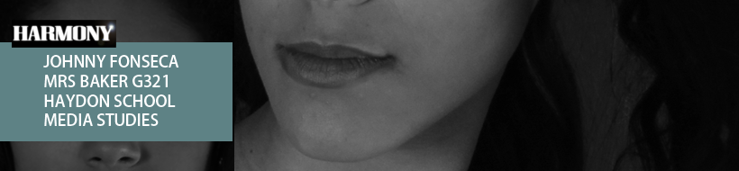
Production Log #42
This is my last production log of the blog, before I begin talking about my final and what I am going to do next I want to say that I really enjoyed creating this blog and it was a great experience and I really developed my planning skills!
Moving on I am very happy with my final piece and I feel personally that it looks really real! I would buy it if I saw it in a shop, Antonia was a great model chose and I got to thank her for her hard work, it's OK I brought her a Nando's in return :D. I am now going to finish this blog with my 7 Evaluation questions, I am going to try change the format of each evaluation to make it look creative and interesting! I want to finish my blog on a good note so I need to put a lot of effort in my evaluation.
This is Johnny Fonseca singing off, Peace
 |
| Now your thinking whats this post going to be about right? |
This is Johnny Fonseca singing off, Peace
Sunday 3 March 2013
Saturday 2 March 2013
Production Log #41
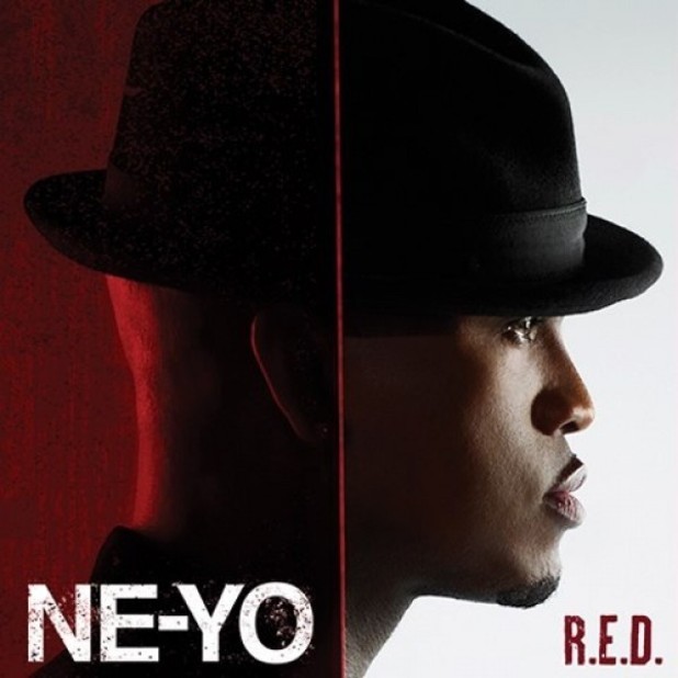
I have just received feedback from my older brother who loves classic/Motown R&B so I knew he was going to be perfect for my feedback, he is actually a subscriber for VIBE magazine so he is use to the magazine format. He actually gave me so much useful feedback that it actually made my magazine look professional and realistic, also instead of making him writing about what he thought I recorded it! Yet again I added a black and white filter to keep the theme going and this time I used a Ne-Yo song from his new album R.E.D. Lastly I did some quick designing on Photoshop and created a banner for my blog but still keeping the R&B theme going, I also came across a cool looking black background on Google image. I then had to change some of the text to white/grey/gold on blog. The colours on my blog also link with the colours used in my magazine!
Friday 1 March 2013
Single Page Contact Sheet & Ideas


 Here is the contact sheet for my single page which I got asked to do by my older brother as he felt there was a lack of her "normal" life, I took advantage with this request and noticed an absence in colour in my magazine. This meant that I had to focus on adding colour into my single page. A problem I encountered when I began creating my magazine was I had already finished the article on the previous double page, however I then began looking at a magazine called "Grazia" even thought it is a fashion magazine I took a look at the magazine and got an idea of adding an "Ups and Downs" part to the single page, this meant I was able to get personal with the fans and talk about Antonias life before she got famous and her live as she is famous and the differences, the fans will feel more connected with the singer as her old life is getting involved. I felt that it was best to talk about the difference with her Living, Fashion and Celebrities. To the side there is a boxed section which has a yellow colour to illustrate the highs and the black to represent the lows, I am going to mimic this but twist it into music and Antonias lifestyle. I am going to at least try to encounter some gold text or a white glow to illustrate that the magazine is flowing and that this page does connect with the overall Antonia section. Lastly I had a tough decision about where I should take the final shot and how I should take it, for this shoot I simply told Antonia to be herself, I told her to come in the current clothes she is in which will illustrate her "normal" side. She then came in a nice dress and her hair tied up which was perfect. Now it was my job about where to take the photo, I didn't actually like the way my house looked in the background so I used my neighbors front gate (with permission!) as an area which Antonia could be in front of, I did this too see as if behind her was her actual house. I took the photo in many different poses and angels however the most simple one won. Eye level with looking straight at Antonia combined with a simple natural simple, perfect.
Thursday 28 February 2013
Magazine Second Draft - Feedback Video
For this feedback I got my older brother to analyse and tell me what I could change to make my magazine look professional and actually suit the R&B music magazines conventions. I chose him as he reads many music magazines especially R&B.
Adding another page?
Also my brother re analysed the whole magazine again and did a thorough look and explained to me that there was a few spelling errors and also that he felt there was a page missing. He wanted a page which illustrated Antonia's "normal life" style before she got famous as these are the story's which fans want to know! He suggested a photo outside of a house or somewhere which symbolizes her neighbor hood/upbringing, this will attract those who want to know her story.
Wednesday 27 February 2013
Production Log #40
Now from my sketch's I created my first draft! I like some of the magazine but parts I think I could work on, but I guess that's why i'm planning on doing another draft other this before my final. I felt that as it's my magazine I should give me own first feedback. I gave myself simple questions like:
-Would I buy this magazine?
-Why?
-How do you think the magazine should look like?
-Would I buy this magazine?
-Why?
-How do you think the magazine should look like?
Tuesday 26 February 2013
Magazine First Draft

I felt that as it's my first draft I should be the one reflecting on it and telling myself my opinion on it and how I could improve it! First off after looking at my magazine from a distance I can instantly tell I forgot to add a bar code! And also I could add the new scan called a QR code. Also I feel there should be a few more sell lines which introduce articles which are within the magazine. Also one major thing which I forgot was the website,price and issue number, these are vital information which are needed on a front cover, without them there would be a loss of information and readers will become confused when they look for it when there about to purchase it. Maybe if I play around with the layout of the sell lines and badge, it will give me more room to put sell lines on the wrong and overall make the front cover look more professional.

This is my special edition front cover which I created, however I wanted to go for the simple look, saying this now looking at the front cover I think it needs a bit more information such as the website, price and issue number/date as this is vital for any magazine. Also I feel there should be something which clearly states that this magazine is special edition, maybe some boxed text.

The first thing I think about when I look at my contents page is non professional and unrealistic. First of all I don't like what I did with the colour photo and gave it less opacity secondly I don't like that I tried to include to main photos, makes the page confusing. I don't know which one to look at as a main image. Also the information part of the contents page doesn't really illustrate what sections of the magazine parts are from, I should use sub-heading for my next contents page. Also I should maybe try add some other pictures instead of two main ones maybe one big and three small? Also I should remove the pull quote as this is a contents page not a double page spread, I know I was trying to link the photo to the article but instead I should replace it with a number next to the image.

For the this double page I instantly can tell the the photo doesn't suit a introduction to an article double page spread, I need to use a photo with less attitude. Also I change the layout of the Antonia and the rest of the sub-headings maybe one under the other. Also for the new photo which I chose I should edit it a bit to make the photo look nice because sometimes there could be marks/scratches on the models skin which could be distracting.

For this double page I feel that I should put the text closer together, there is too much space in between the texts, also the photos layout isn't appealing, it just seems like I crammed lots of photo on a page and added text. However I really like the way I added gold on to parts of the text which are questions, there easily seen . Lastly there are no pull quotes, nothing which will pull the reader in and the photo seems too happy for a article double page spread as this is the page where it holds all the information. I should use a photo where she is posing.

For my last double page spread I really should add at least some text with a square behind it to stand out, I don't want to change the colour of the font as that can be confusing and distracting for the readers. I really feel the the behind the scenes is a really good idea and the photo used for this page is brilliant and represents classic R&B.
Sunday 24 February 2013
Production Log #39
The sketches of the magazine are very basic as I had no idea what I was doing, this meant I did not do enough research! I went back to the internet and look at magazine, there was one article which caught my eye, it was an article in about Tulisa, the article combined with the photos gave her this really elegant look, and on top of that I really liked the layout, and you can tell that they used a sepia type effect on top of the photos in my case it would be black and white.

Saturday 23 February 2013
Sketch of R&B Magazine Front,Contents and Double Pages
Front Cover Sketch

This is my first plan of my magazine, as I am going to for classic R&B magazine I wanted the front cover to be very simple but grab the readers attention and to do this I thought a competition would lead people into the magazine. I also wanted to have a name which will focus on the R&B genre so I felt "Harmony" was best suited. Also moving on I want to use a nice clean portrait shot of my model in black and white on the front cover. I also felt that by adding artists names, this would then attract readers who are fans of the following artists "Ne-Yo, Trey Songz, Rihanna, Beyonce or of course the main artist for this issue, the new upcoming "Antonia".
Contents Page Sketch

Moving on I wanted my contents page to be clean and simple, I didn't want too many pictures maximum two I did this as the main objective for the contents page is to inform and by having so many pictures and colours on the page the reader will get confused and instantly get distracted by all the colours and not the information itself.
1st Double Page Spread

On the first double page I wanted this page to be an introduction page to the whole interview, saying this meant that there was only going to be a little part of the article to introduce the article and set the interview and then to engage the audience I would use an interesting pull quote to grab them into the article and make them read it! Also I felt a large photo of Antonia should be displayed on the double page to illustrate who the article is on. Of course I added the page number and website to each page in the magazine, as this is a convention of a music magazine.
2nd Double Page Spread

This double page spread is the where the main chunk of the interview/article will be at, this means that I have to have some sort of thing to grab the audiences attention while there reading the article to keep them interested. For example after a column of article I have included a column of photos which will be all studio shots of the artists, this is so that the readers are kept entertained whilst reading the article. I then add the rest of the article column which will then finish on the next double page spread. Then to finish off the double page spread I will present a photo of the artist on a whole page. Not forgetting the convention of the page number and website on each page.
3rd Double Page Spread

Lastly This page was simple, it was the last page of the article so I instantly knew I wanted the main photo to be a performance shot which will be placed in the background and on top I would have a quote displayed to keep the readers going and for them to finish the article. Then I would finish the article. Lastly I also added an image of a behind the scenes shot and will be adding a description or the readers to visit the website to view the behind the scene, this will then create more traffic for the magazines website.
Friday 22 February 2013
Production Log #37
 After some thinking and discussing with my teacher she explained that it was a great idea and that no one has done anything like it in my class, so of course I went with it! It was actually really fun to record it. When editing the video I put a black and white filter on to bring that reoccurring R&B classic theme to the blog. It also gives it a nice look, very formal! Now to begin the magazine, Lets Go! (Ne-Yo uses that catch phrase a lot on his twitter! (And yes I am a Ne-Yo fan.)
Wednesday 20 February 2013
Interview with Antonia
Here is a quick interview I did with my model to see how she got on when doing the photo shoots. I am very pleased she enjoyed her first ever photo shoot and I hope I will use her for my other media projects in the year to come.
Tuesday 19 February 2013
Production Log #36
After some thinking I knew the video would take a max of 1 hour to create, edit and upload so I did it. If you noticed I added a backing track from a famous R&B girl group. I wanted that R&B theme and genre to be reoccurring in my magazine. I also had in mind an interview of some sort to see how my model got on.
Sunday 17 February 2013
Editing Antonia
Here is a video which I recorded using a program called Frapz, I basically illustrate how i edit my photos and how they get that professional look. I used a backing track song to make the video less boring. The song I used is "Say My Name by Destinys Child", a very well known R&B song and any fan will recognize the song.
Friday 15 February 2013
Production Log #35
After my 2nd photo shoot I booked my 3rd and final photo shoot in the studio immediately as everyone in Media Studies is at the point of needing photos to use for their magazine meaning slots were going quick and my model was busy a lot of the days! I was lucky to get the studio for a good 2 hours but the problem was I was really looking forward to doing a time lapse but why I was booking equipment I forgot I needed two cameras! By the time I remembered all the cameras were gone. I just had to stick with behind the scene photos. I am now thinking about making a video on how I edit a photo and what I do to make it look professional.
Wednesday 13 February 2013
Photo Shoot 2 - Studio


This the the final photo shoot I did for my model and these are the photos which I will be including for my official magazine not like the first shoot which was for my "Special Edition" magazine. Also this photo shoot was done in a studio whereas the first one was done on a stage to give it that live look and feel to the photo. I wanted her personality to shine through the photos, I didn't want them to be all just fashion like poses. You can clearly see that I used both a black and white backdrop as I wanted to give the photos a different overall mood, I also chose to photograph both black and white as I felt that once I took the photo in black and white I was able to see how the photo looked as I still had in mind the classic black and white feel throughout the whole magazine. I am very happy with the photos which I took and the next time I do a photo shoot I need to remember to book two cameras out so I can create a time lapse as I totally forgot to book two out and when I realized all the remaining cameras were gone.


Due to me forgetting to book an extra camera out I just took behind the scene shots to illustrate how we set up the photos and how we ended with our end result. As you can tell I higher one of the lights to light the top half of her body, I used an umbrella to make the light hit her skin softly instead of very harsh and bright. I also user a light to light the side of the model so we could still see her outfit in the photo as they are vital for the magazine.
Monday 11 February 2013
Production Log #34
 So my last blog post illustrates that I did two photo shoots instead of one due to lighting errors. Firstly I was trying to create a silhouette effect but didn't have enough lights! I then spoke to my teacher about my photos and she told me to re-book and do a photo shoot using the continuous lighting which gives a softer light to the skin. Once I got that up and going the photo taking came natural and all my photography course and hobby came in to action.
Saturday 9 February 2013
Photo Shoot 1 - Stage
My idea for the front cover image was very complex, I didn't want to go for the plain studio photo. I wanted the image to scream R&B. I wanted to make sure everything in the photo was done on purpose e.g. costume, jewelry, pose, lighting, ect. However for such a photo I had to do a lot of practice until I got the right shot. The hard part of the photos were defiantly the lighting side, I had to do two separate photo shoots just to get the photo I wanted however the photo and the effort I put in to take it was worth it.
This contact sheet is from the first photo shoot, as you can tell I was attempting to do a silhoet look, the problem yet again was the lighting. I kept moving the lighting to get the best look and feel to the photo, but due to my limited knowledge it was hard to take the photo I wanted. I felt this photo shoot was a taster and a sort of test with model.


The second photo shoot went much better, once I showed the photos from the first photo shoot to my teacher she told me what I could do to improve, the main issue was in fact the sort of lights I was using and not the positioning. She taught me the basics on how to set up the new lighting which is know as "Continuous Lighting", these lights weren't as harsh to the models skin tone like the previous set of lights which I was using. As i finally worked the lighting I was able to put more attention to the positing and angels of the photos. As I wanted the photo to look like a live performance so I told the model she had to sing and really go for it as if she was really on stage, I wanted her to vision herself on that stage, all the emotions which would be portrayed by facial and body expressions. I took many successful photos in this photo shoot and with a bit of editing on Photo Shop it would create the idea photo which I really wanted to create. Lastly I was lucky enough to find the retro microphone which is very rare to find, the prop really concludes the R&B genre as a whole.


I was also able to get my teacher to take a photo of me taking a behind the scenes photo of the lighting set-up and the position of the model. The pose which the model is doing is a section which we had her just sit on a chair and do different poses. One of my favorite photos from this shoot was in this section and that's why I used it as my "Special Edition Front Cover". As you can see I clearly used continuous lighting which meant her the light didn't hit her skin as harsh as the first set of lights I used in the first photo shoot. However in this photo shoot I positioned one light behind her but to a slight angle to back light her and to complement that I added a light to the left side of her to give her front lit, but by placing the light further away the lighting became more natural. As I had the lights shining on her, her dress sparkled and gave the photo a really good effect.
Friday 8 February 2013
Production Log #33
Now that I have the rights to use the photos I have taken of Antonia I am able to begin photo shooting! I was able to book out my school stage which means it wont be as fancy but with a bit of cleaning and the use of black curtains I can make it work! I am up for a challenge!
Wednesday 6 February 2013
Model Release

Tuesday 5 February 2013
Production Log #32

Transcript:
The last thing I did on this blog was create my equipment document and uploaded it. I included some pictures to make the writing not drag on as much! But the next task is simple, before we do my photo shoots I get my model "Antonia" to sign the release form to state she gives me the right to use the photos for my AS Media Magazine (R&B).
Sunday 3 February 2013
Friday 1 February 2013
Production Log #31
I have previously created a locations idea, however my photo shoots don't really consists on any outdoor location except if its a performance or an event, however I thought about using a forest but I explain in the post why its a bad idea, I have now decided that I am going for studio photos and a performance shot, now to find a stage! Next I begin to talk about my equipment which I have used/will use in the next couple of weeks!
Wednesday 30 January 2013
Sunday 27 January 2013
Production Log #30
I feel that my work is actually looking really professional and if you haven't noticed I am going with a very classic theme on my tasks so that my blog is flowing and looks interesting. I added a lot of information with the amount of space I had for New Media, I then uploaded the presentation to scibd, but next time I should remember about using sliderocket! http://www.sliderocket.com/
Saturday 26 January 2013
Thursday 24 January 2013
Production Log #29
This month the Golden Globe awards took place, this award
ceremony are best known for films, however they
still appreciate musical talent. The nominations for
best original song picture were:
 As show in
the image about, Adele the Rolling in the Deep singer won an award for her song
"Skyfall" which was recorded for James Bonds last movie. Adele is a R&B and Soul singer, and in my magazine
I am going to add an award ceremony of some sort as it is interesting for fans
to know. Also, music magazines need to ensure that they know all of the
latest news on artists that they are going to interview for articles to ensure
that the information is current and exclusive.
As show in
the image about, Adele the Rolling in the Deep singer won an award for her song
"Skyfall" which was recorded for James Bonds last movie. Adele is a R&B and Soul singer, and in my magazine
I am going to add an award ceremony of some sort as it is interesting for fans
to know. Also, music magazines need to ensure that they know all of the
latest news on artists that they are going to interview for articles to ensure
that the information is current and exclusive.
Going back to the blog I just finished my Promotional methods
and I created the ads on Photoshop and extracted op top of an
ad, I was surprised how real some of them actually look. It was
interesting to see how I would present my magazine if it was to create ads like
that. My next task is New Media and this seems to be an easy topic for me as
I indulge myself in too many social networking site, so lets see how
I go!
Tuesday 22 January 2013
Promotional Methods
To promote my magazine I have begun thinking about various methods. I want my magazine be a big hit when it first comes out, sales need to be high and the only way that will happen is it I promote the magazine well. As it's the first issue and it actually hasn't got a fan base yet I need to invest a lot of money into promotion such as billboards,social media,ect.


Another way of advertising my magazine could actually be placing an advert on the side of the bus. The bus itself travels a lot meaning lots of people can see them, as they are public transport everyone keeps an eye out for them so it would be a great investment for harmony and it grabs peoples attentions when the bus passes them. I could also use the underground/tube to advertise my magazine, this will probably be to advertise our older target audience. I could put posters along the escalators and also the big adverts on the tube tracks. Lastly this type of advert is rare but I could use some stairs, and when people are walking towards the stairs they will see our advert, each stair will have a slice of the advert and went seem at a distance it will create a poster.
 I will make sure that the adverts are to the point and fit to the audience ideas I received. I have to make sure that the adverts and content reach to the correct market. For some extra advertise I will start the first issue to meet Antonia and have a meal with the singer and a signed copy of her brand new single, some of the rules of the competition will be that the person who enters the competition must have be subscribed/connected/liked with all of Harmony's social networking sites. By doing this I can build an online following and gain more audience members interacting with the magazine, which will in turn rise sales. I felt that a meal with Antonia will be more interesting to fans and also that she is so brand new that there will not be a tour/gig any time soon as she is recording however due to this the competition will give a signed copy of her brand new single.


Another way of advertising my magazine could actually be placing an advert on the side of the bus. The bus itself travels a lot meaning lots of people can see them, as they are public transport everyone keeps an eye out for them so it would be a great investment for harmony and it grabs peoples attentions when the bus passes them. I could also use the underground/tube to advertise my magazine, this will probably be to advertise our older target audience. I could put posters along the escalators and also the big adverts on the tube tracks. Lastly this type of advert is rare but I could use some stairs, and when people are walking towards the stairs they will see our advert, each stair will have a slice of the advert and went seem at a distance it will create a poster.
Billboards will be shown across the country as I need to let as many people know about this magazine. I will solely focus on my target audience of 17-25 years so that the adverts will actually grab there attention. I will do some research into my locations for my bill boards because certain areas in the UK could have a different genre vibe/feel. The Billboard will look something like the billboard to the right, it has a photo which illustrates the release date,website and name of the magazine and also includes a teaser photo where the artists face is darkened out due to shadows.
 I will make sure that the adverts are to the point and fit to the audience ideas I received. I have to make sure that the adverts and content reach to the correct market. For some extra advertise I will start the first issue to meet Antonia and have a meal with the singer and a signed copy of her brand new single, some of the rules of the competition will be that the person who enters the competition must have be subscribed/connected/liked with all of Harmony's social networking sites. By doing this I can build an online following and gain more audience members interacting with the magazine, which will in turn rise sales. I felt that a meal with Antonia will be more interesting to fans and also that she is so brand new that there will not be a tour/gig any time soon as she is recording however due to this the competition will give a signed copy of her brand new single.
 Sunday 20 January 2013
Production Log #28

I created a cool looking prezi on Props and Costume with lots of images and went in too detail and why I needed certain things to create that R&B look. I will now be moving on to Promotional methods for my magazine and I really want to go back to the blog platform, so I am going to write it in blogger and add some created JPEGs which I will create with photoshop.
Thursday 17 January 2013
Tuesday 15 January 2013
Production Log #27
After gathering some ideas for heading/sub heading I began thinking about my props and costume which I will need to create that classic R&B look, I have already thought about the different dresses and outfits and I have begun to think about what goes with one, and lastly I have already thought about that all important prop the microphone.
Monday 14 January 2013
Headline/Subheading/Pull Quotes
I have been thinking of a headline and subheading the past few days and after looking at other magazine I came to a conclusion that these ideas would best suit an R&B music magazine. My pull quotes are very engaging and the audience will instantly want to know the back story to them. If the reader is just flicking through the magazine they will still see a glimpse of the article as these pull quotes will stand out to them.
Saturday 12 January 2013
Production Log #26
The only big problem I had with writing my article was actually starting it, once I got that sorted the rest was easy, the only thing which was an issue was the time spent doing the article, lets just say I went to bed pretty late finish it off. I really wanted to do the article all in one go as I had really good ideas and finish the article would be faster then writing notes about it! At least I motivated myself to finish it, right?
Thursday 10 January 2013
Monday 7 January 2013
Production Log #25
After reading so many article to get an idea I wrote my article really easily, all I had to do was have a bit of peace and quite and have a story in mind and the rest just came at an instant! I felt like I used that 1 to 1 tone in my article which really engages the reader with the magazine.
Sunday 6 January 2013
Contents Page Ideas
Contents Ideas
Featured
-Antonia
-Trey Songz
-Ne-Yo
-Beyonce
-Rihanna
-Top 50 albums of the year
-The Brits BACKSTAGE
-Beyonce UPCOMING TOUR
Fashion
Recent clothes which celebrities have worn
-THE NEW SCHOOL - Five menswear designers offer new perspectives
-Beyonces look - How beyonce gets her everyday look but still looks fabulous.
Regions:
-Letters and emails: Write your letters and email and we'll them and get back to you, we might also feature it in the magazine.
-The Editor: editor bio
-Competitions
-Fan comments: messages sent from artits fans
Subsription:
Subscribe today and save £20
Go to: www.harmonymagazine.co.uk
Or call us on 0800 512548
Editors Note:
Welcome to this months issue of Harmony. We have a lot of new things in this months magazine including an exclusive interview with pop sensation Antonia Strachan. A lot of gossip with other artists such as Ne-Yo and Beyonce. An amazing line up for this months upcoming gigs.Amazing opportunities to win tickets to see your R&B idol, just try out this months competition. Johnny Fonseca, Editor
Social Media
Follow us on Twitter @HarmonyMag
Follow our Instagram @HarmonyMag
Follow us on SoundCloud for exclusive music Harmony Magazine.
Like us on Facebook www.facebook.com/harmonymagazine
or visit our website: www.harmony.co.uk
S
Thursday 3 January 2013
Production Log #24

Transcript:
After looking through many magazine for sell lines I did a blog post about the ones which I thought were good and that I could use for my magazine. The next task for me seemed hard, I didn't really understand what it wanted me to do, but after discussing this with my class mates and teacher I found out its just notes on what I am planning to include in my contents! I looked at other magazine from all different genres and took pieces of each to make the one contents page fit for a R&B fan! As I am trying to engage other audiences in to liking R&B I have to include new stuff which magazines haven't added before such as upcoming concert pages.
Subscribe to:
Posts (Atom)